

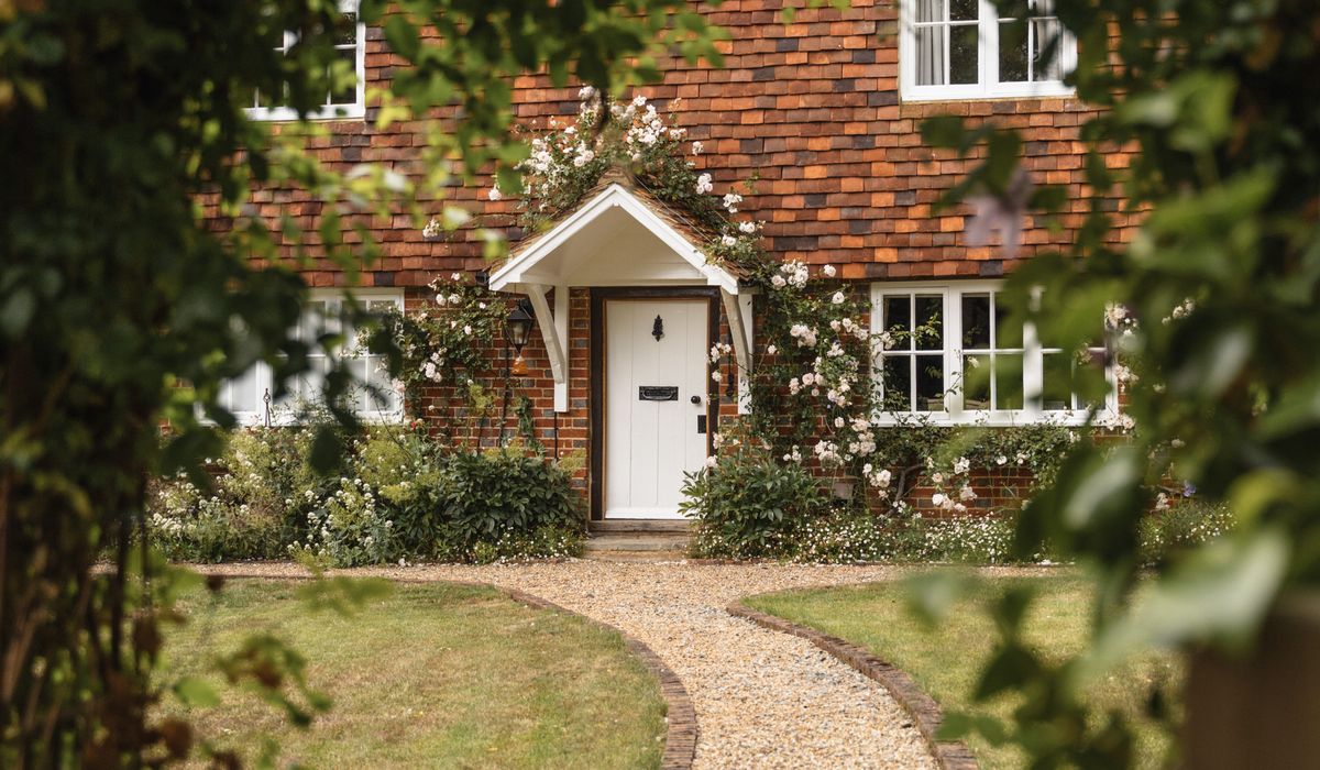
A converted barn is not a cottage with taller ceilings. It is a big, open, often awkward volume with light arriving from unexpected directions and bouncing off surfaces that were never meant to be seen. Those huge gable windows at either end, the double-height space in the middle, the timber frame crossing it — they all change how a colour reads once it is on the wall rather than on a two-inch card.
Two things catch people out. First, scale: a colour that feels soft and gentle on a sample pot can become surprisingly assertive across twenty metres of plaster. Second, light: the same colour will look creamy at eleven in the morning, grey by four, and almost blue on a January afternoon. Barns are honest buildings, and they show up any decision made too quickly.
Get it right, though, and a barn can feel extraordinarily restful — like a deep breath after a long walk.
Before you think about shades, spend a week watching your rooms. Note which elevations face north and north-east, because that light is cool and slightly blue, and it will drag any colour with a grey or green base towards coldness. South and west light is warmer and golden, and it flatters almost everything.
Also notice how light moves across the day and where it pools. In a barn, the brightest wall is often opposite the window rather than beside it, and the darkest corner may sit under a gallery or behind a beam.
If your barn has a mix of orientations, choose one palette and let it shift gently from room to room rather than changing character entirely.
Calm interiors rarely come from bold choices. They come from colours that sit quietly next to natural materials — oak, limestone, brick, slate, wool, linen — and let those materials do the talking.
Chalky neutrals are the backbone. Think off-white with a touch of stone, pale oatmeal, soft almond, or a clay-tinged cream. These read as light without ever being stark. Keep them away from anything with a blue or violet undertone, which tends to look thin against old timber.
Muted greens are the natural partner to a barn. Sage, eucalyptus, dried rosemary, lichen and soft olive all echo the landscape outside and work beautifully on timber, tongue-and-groove panelling and cabinetry. They are also forgiving of the uneven surfaces typical of old agricultural buildings.
Warm greys — greige, mushroom, taupe, warm putty — are useful for linking rooms and for grounding large expanses. They are particularly good on ceilings, where a true white can feel glaring above exposed beams.
For depth, add one or two darker anchors: a slate blue-black on a chimney breast, a deep olive on a boot room, an inky grey-brown on cabinetry. Used sparingly, these give the eye somewhere to rest and make the pale walls look even softer by comparison.
Sample pots painted straight onto the wall tell you very little. The existing colour underneath alters them, and you cannot move them into the dark corner or hold them up against your beams.
Instead, paint A2-sized boards — large enough to judge properly — with two full coats and leave a white border around the edge to frame the colour. Then live with them.
Limit yourself to three or four candidates per room. More than that and the eye stops being able to judge, and the whole exercise becomes noise.
Finish matters almost as much as colour. On old, breathable walls — lime plaster, lime render, stone — a matt, mineral-based finish will look softer and settle more naturally than a vinyl emulsion. The higher the sheen, the more intense and slightly plastic a colour can appear, and in a space with this much light bouncing around, that reads as hardness.
Texture softens everything: limewash with a little movement in it, rough-sawn timber, wool throws, linen at the windows, a worn flagstone floor. If you are keeping timbers exposed, resist painting them the same colour as the walls. Let them stay a shade darker and slightly warmer so the frame still reads as structure.
Lighting is part of the palette, too. Warm bulbs around 2700K, lamps rather than a grid of ceiling spotlights, and pools of low light in the evening will make chalky neutrals glow where a cool white bulb would turn them flat and grey.
No colour in a barn looks the same in July as it does in February, and that is not a fault — it is part of the pleasure. A well-chosen scheme shifts gently with the light rather than fighting it.
Choose colours that still feel right on the dullest day, when the light is low and grey, and trust that they will only improve once the sun comes back. If a shade sings in bright sunshine but goes cold and dispiriting under cloud, it is not the one for a barn. The colours that last are the ones that hold their warmth all year round — quietly, undramatically, and exactly as a calm rural interior should.

Sleekbarn Real stories, useful guides and the occasional recommendation, all in one calm corner of the web.

Sleekbarn No rushing, no fuss — just thoughtful notes and practical help, written by people who care.

Barn conversions can lack built-in storage. Use eaves, understairs gaps and freestanding joinery to keep rural rooms tidy without losing character.

Comments
ALina Kelian
19th May 2018 ReplySleekbarn We spend our time finding what works so you don't have to, and sharing exactly what made the difference. ullamco laboris nisi ut aliquip ex ea commodo consequat.
Rlex Kelian
19th May 2018 ReplySleekbarn No rushing, no fuss — just thoughtful notes and practical help, written by people who care. ullamco laboris nisi ut aliquip commodo.
Roboto Alex
21th May 2018 ReplySleekbarn We spend our time finding what works so you don't have to, and sharing exactly what made the difference. ullamco laboris nisi ut aliquip ex ea commodo consequat.